
Year. 2022
Client: Walker Healthforce
Project Overview. Walker Healthcare, a woman-owned healthcare and IT staffing company, needed a strategy that would unify its two entities—Walker Healthcare and Walker HealthcareIT—while refreshing its brand positioning for expansion into new U.S. markets. Enter Walker Healthforce: a human-centric rebrand designed to highlight the people, expertise, and energy driving the company forward.
Team. ECD: Jennifer Grasso; GCD: Eric Livingston; Developer: Brian Marrocco; Project Manager: Andrea Santarlasci; Jr. CW: Cole Guidry
Role. Brand Designer, Art Director, UI Designer
A New Logo
Changing the brand identity not only required a merging of their ‘Walker Healthcare’ and ‘Walker HealthcareIT’ accounts, but also a new strategy to build their audiences in the digital space. After many variations, my final design for a new logo was approved.
12 Tenets
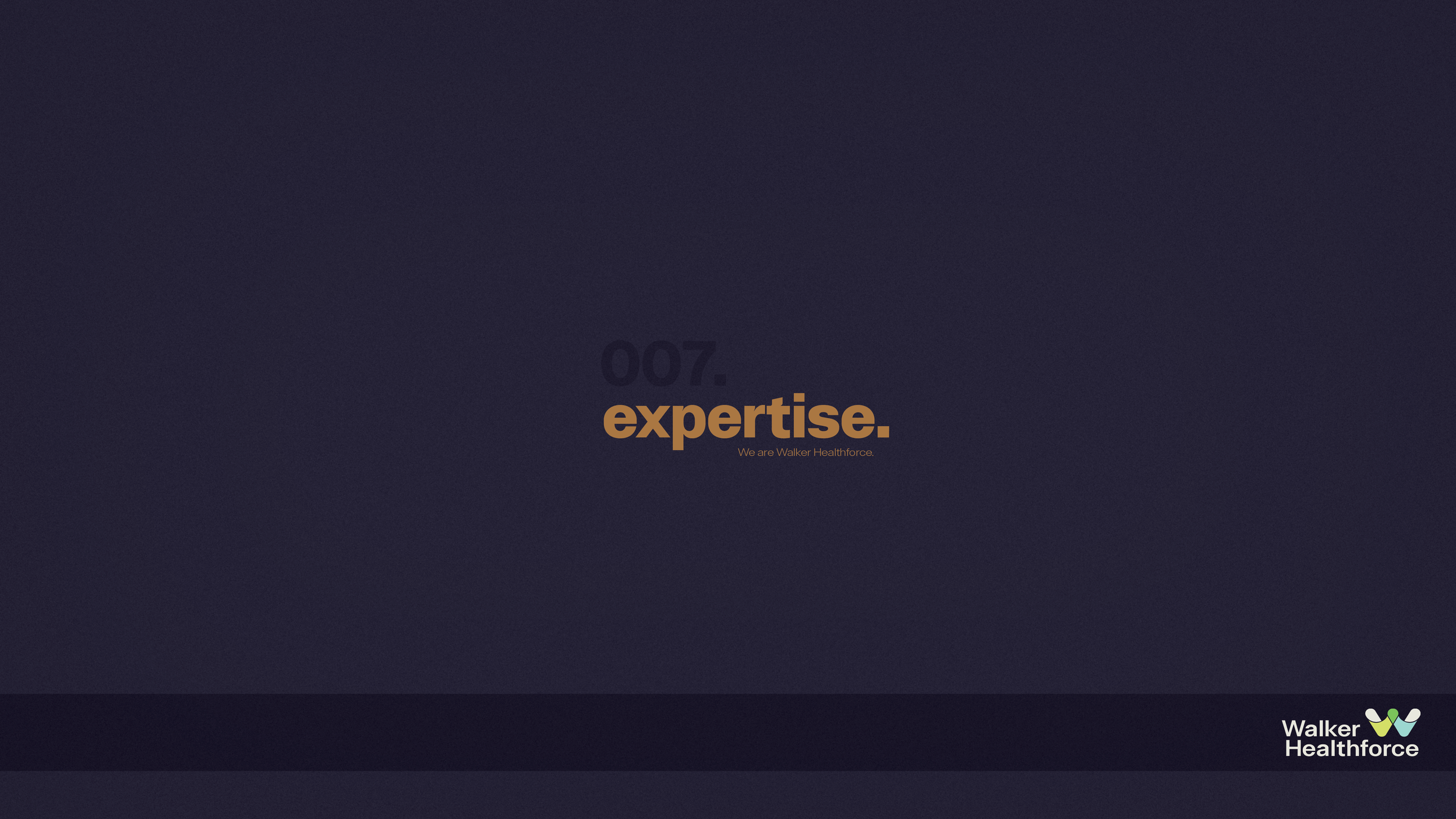
A set of twelve tenets were created that best communicated the brand’s mission statement. Adding this into the new brand identity gave a set of key attributes that established who Walker Healthforce was and is at their core.


Let’s Talk Website.
The merging of the two entities required a merging of two websites: this was a crucial step for the brand, as their website was an important method of communication between Walker Healthforce and their audiences. That said, leading the redesign of their website was my primary goal following the approval of their new logo.
The Wireframes
I teamed up with our UX designer to conduct an audit of their existing site. One of the biggest challenges was trying to create a structure and strategy that worked around their extensive navigation; due to budget constraints, reducing the amount of pages wasn’t an option. So we needed to create a framework that relied heavily on redesign and restructure without removing or adding any pages.

Atoms & Molecules
Rather than designing page by page, we built a system from the ground up—starting with typographic hierarchies, colors, and grids (atoms), then scaling into reusable components and modules (molecules). This approach became our shared source of truth, allowing the developer and I to work in parallel and move efficiently.

The Result
As mentioned prior, the biggest challenge in this redesign was the bulk information across pages. Making room for ample white space and keeping the design simple and purposeful ensured success in this new design.

LUDWIG+
Looking for more?
Or if you know what you want… that’s cool too.
CQ MEDICAL

PINK FUND

BIG DEAL