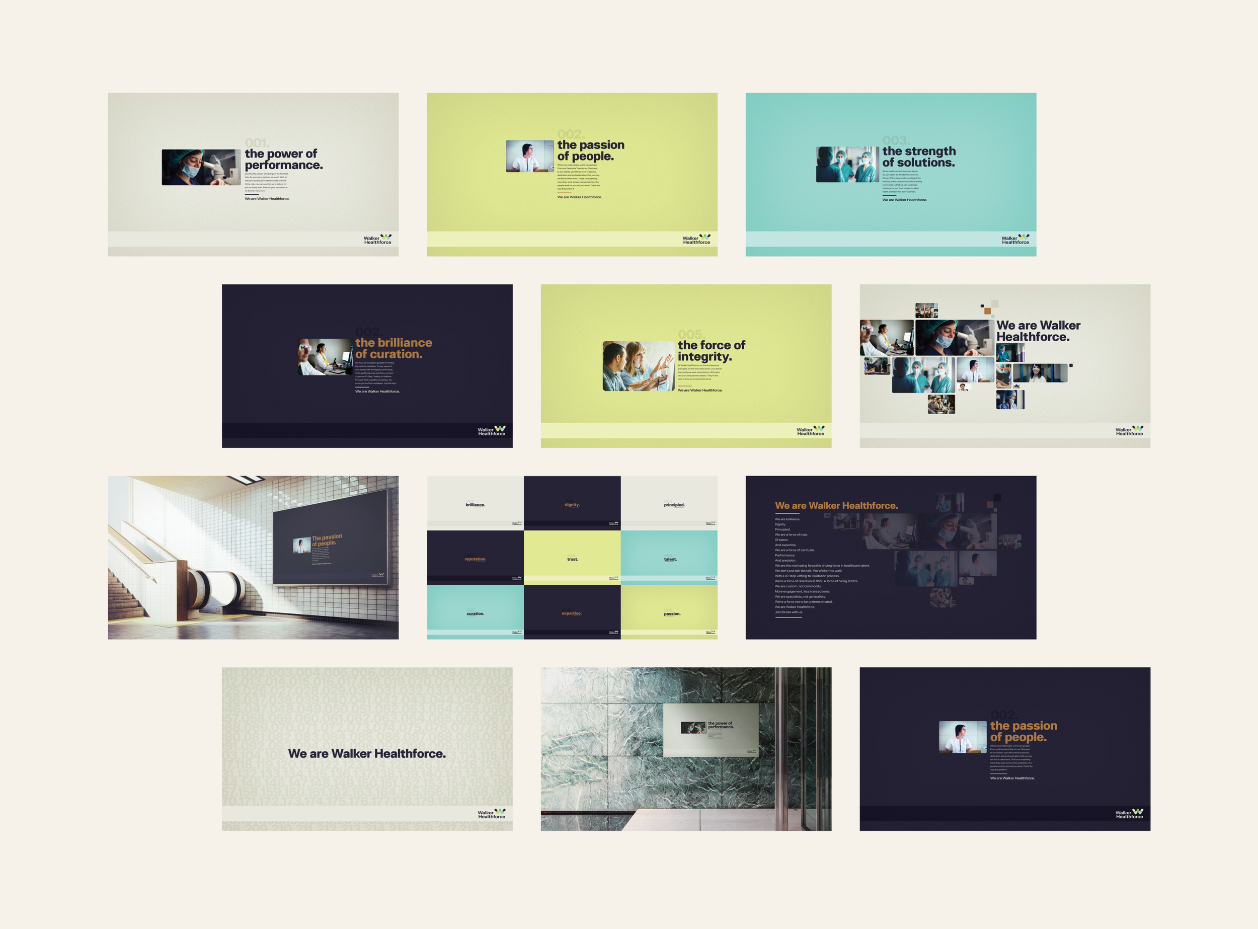
Walker Healthcare, a woman-owned healthcare and IT staffing company, needed a plan of action that not only combined their two entities - Walker Healthcare and Walker HealthcareIT, but also updated their brand positioning as they ventured into new markets across the United States.
Under this project, my goal was to translate the new Walker Healthforce identity into digital media and print for both internal and external audiences. As a recruitment firm, the brand primarily reaches their prospective clients and recruits through social media. Changing the brand identity not only required a merging of their ‘Walker Healthcare’ and ‘Walker HealthcareIT’ accounts, but also a new strategy to build their audiences in the digital space. With this, a new logo was also needed for their channels.
A set of twelve tenets were created that best communicated the brand’s mission statement. Adding this into the new brand identity gave a set of key attributes that established who Walker Healthforce was and is at their core.
Additionally, the merging of the entities required a merging of two websites into one. This was a crucial step for the brand, as their website was an important method of communication between Walker Healthforce and their audiences. That said, leading the redesign of their website was my primary goal following the approval of their new logo.
IT STARTS WITH
SOME WIREFRAMES.
Before designing, I teamed up with our UX designer to conduct an audit of their existing site. One of the biggest challenges here was trying to create a structure and strategy that worked around their extensive navigation; due to budget constraints, reducing the amount of pages wasn’t an option. So we needed to create a framework that relied heavily on redesign and restructure without removing or adding any pages.
Our high level goals were to:
Combine two websites into one without adding or removing pages
Make it easy to navigate and use for both prospective clients and recruits
Create a platform that mirrors the new Walker Healthforce identity
After our wireframes were approved, I built a design system that included typographic hierarchies, color tints, elements, and grids - or atoms. This would then be the ‘source of truth’ in design for the developer and I moving forward.
ATOMS.
For this project, we decided to approach this redesign not page by page, but instead by components and modules - or molecules. This way, the developer and I could work in parallel - increasing efficiency to accommodate for a quick turnaround time.
MOLECULES.
As mentioned prior, the biggest challenge in this redesign was the bulk information across pages. Making room for ample white space and keeping the design simple and purposeful ensured success in this new design: keeping it airy, professional, and clean meant the website could house heavy content without making journeys convoluted and confusing.
THE OUTCOME.
Walker Healthcare, Client
Jennifer Grosso, Executive Creative Director
Eric Livingston, Group Creative Director
Brian Marrocco, Developer
Andrea Santarlasci, Project Manager
Cole Guidry, Jr. Copywriter
Brand Transformation
Visual Identity
Art Direction
Digital Media
UI Design
Prototyping


